


HoldtheFrontPage is unveiling a fresh look today with a new masthead, a higher profile for journalism courses and an expanded content area.
Gone is the narrow middle column on the content and jobs pages enabling stories and job adverts to expand across a wider area.
The new-look header, which is also being rolled out across our social media channels, includes a lower-case masthead designed to be more reflective of the HoldtheFrontPage brand name.
And journalism courses also have a new home in a right hand sidebar with a new featured courses scroller to complement the existing featured jobs scroller.
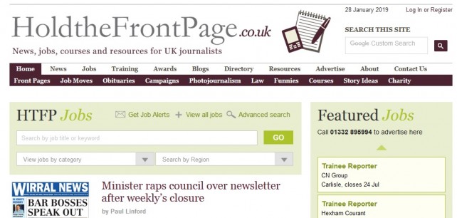
There are also changes to the category pages with thumbnail images introduced alongside stories for greater visual impact.
Links to Related news and Related topics, which previously appeared in the middle sidebar, can now be found at the bottom of each story.
Publisher Paul Linford said: “The redesign carried out last spring which aimed to give greater prominence to our jobs platform has gone down well with advertisers and we wanted to build on this.
“This latest set of changes are a refresh rather than a redesign but we hope that getting rid of the middle column will give both our stories and jobs pages greater visual impact and more room to breathe.”
The changes have also enabled us to increase the font size on the text of stories and job adverts as well as on headlines and job titles, although the font size on story comments remains the same.
Added Paul: “Important as it is for us to provide a forum for debate about the industry, we want to be judged primarily on the quality and accuracy of our news coverage and the difference in font size is designed to emphasise this.”
 Sign up for our free daily email bulletin
 Follow HTFP on Twitter
It looks good but the page keeps jumping up and down on my Macbook Air so I can’t read anything
Report this comment
The site doesn’t load in an iPhone without the first story being missed off, (there’s an empty space?) so it’s not user friendly or easy to use
Very off putting
Report this comment
It’s really not user friendly at the moment I’m afraid, like others have mentioned, it jumps around and on my iPhone i too can’t see the first story
Report this comment