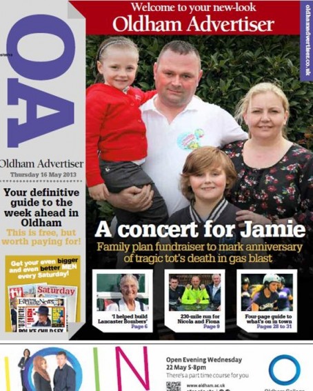
Trinity Mirror says it has “thrown out the design rule book” with a radical revamp of one of its free weeklies in the North West.
The Oldham Advertiser has undergone a total redesign with a poster-style front page and a digest of the week’s major stories on page three.
In a news release, the company said the changes represented “a new approach to producing weekly newspapers.”
It said the paper had been redesigned with “a bold, forward-thinking approach aimed to attract a new generation of readers and advertisers.”
The new design was created by Spencer Rowbotham, head of creative for Trinity Mirror Regionals, and Justin Connolly, senior designer at the Manchester Evening News.
Rob Irvine, editor-in-chief of MEN Media, said they had “thrown away the rule book for newspaper design.”
The Advertiser, which read by an average of 85,000 people, now carries what the company says are “shorter, punchier” page leads with an increased story count and new community-focused pages.
Stories are presented in a “brighter, simpler, easier-to-read format”, and images are given “a better chance to make an impact.”
Editor Bethan Dorsett said: “We’ve very excited about the new look Advertiser. We’ll still be carrying all the news from around our community but with a fresh twist.
“We aim to make the Advertiser the essential guide to the week ahead with an emphasis on the wonderful characters that make our town tick.
“I firmly believe that we are merely custodians of the Advertiser and its true owners are our readers.
“As such, we’ll be making a fresh appeal to our readers to tell us about their news, views and celebrations and we’ll be making it easier than ever before for readers to get in touch with us.”
Added Rob: “The focus of the content is on the communities of Oldham. This is their paper and they have a chance to play a bigger part in helping us decide what we publish in terms of news and views.
“As for the design, we have thrown away the rule book for newspaper design and embraced many ideas from other forms of print media plus lots of ideas of our own. It is set to change the way we look at newspapers.”
Regional managing director Steve Anderson Dixon said: “We wanted to take a more radical and unconventional approach in design, presentation and content.
“I’m confident that our readers will love it and our advertisers will be thrilled with the changes.”


 Follow HTFP on Twitter
Well, I usually moan about anything, but I quite like this. In times where the issues are more and more at a national and global level, rather than local, this seems to be a good approach. More light-hearted, more informative, less preachy, less ‘worthy’. Still a town in serious decline though
Report this comment
Nice one, Rob. Big and bold and will attract the readers.
Lots of pressure on photographic to keep on coming up with the goods though.
Deserves to succeed.
Report this comment
I think this is pretty smart to be fair!
Report this comment
Why not. Declines in ciculation have been with us for years (for a huge variety of reasons obviously) yet still the majority of papers religiously follow the usual failing formula.. Might as well try something different..
Report this comment
Nice redesign. Looks like a website.
Better than the direction of some revamped papers which now resemble freesheets.
Good luck with it. Looks like decent human interest stories too.
Report this comment
Like it – though I think they have The Indy’s i to thank for a bit of inspiration. Hope others are taking note.
Report this comment
“Thrown out the design rule book”? Surely “copied the i “?
Report this comment
I like this. However, the industry’s preoccupation with design is just displacement activity in the face of ever smaller editorial teams. Ultimately it’s the quality of the stories that matter.
Report this comment
We’ve gone for a similar concept with the design on our new free newspaper in Bournemouth – Seeker News. We’ve also taken inspiration inside from i and some of the American publications we’d been looking at.
You can see the latest issue online at:
http://issuu.com/seekernews/docs/seekernews15
Report this comment
It’s a straight rip-off of i, isn’t it? Not that that’s a bad thing. I’d like to see inside.
Report this comment
I like the Seeker News a lot, Steve. Especially the news map and the headline FLYING SAUSAGE.
Report this comment
Proper design work by people who know what they are doing. Bravo!
Report this comment
Great revamp! More a read-a-week than a throwaway freebie.
Report this comment
Cheers Roy, we have a lot of fun with our sub, on a previous issue we managed to reference 3 Style Council songs on one cover – but that’s just our strange sense of humour.
Report this comment
I can’t see a cover price, is it a free ?
Report this comment
Like this a lot, well done to all involved.
Report this comment
Very nice, I think the format is something called a ‘magazine’…;)
Report this comment
It also looks like the 20p i
Report this comment
Reminds me of the over-before-it-began Cambridge First by Archant.
Report this comment